
Tuesday, 28 February 2017
Wednesday, 22 February 2017

Friday, 10 February 2017
Trailer Draft 2
Wednesday, 8 February 2017
Magazine Draft 2

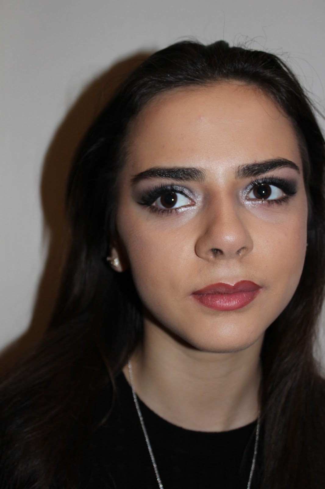
Sunday, 5 February 2017
Poster Draft 2

Here
is my second draft for my poster, since the first I have changed the picture as
the character looks more approachable and I think will connect with the audience
better. I have darkened down the right side but still slightly blurred in and
then added more details to the poster. I have also changed the font of 'Ever
After' so that it matched with the other products from the campaign which means
that there's recognition between all three for the audience to connect them
with.
Saturday, 4 February 2017
Magazine & Poster Photos
Once I had planned what my magazine and poster looked like I then had to go out and take the photos for each of these:
Magazine:


Poster:

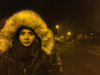


Magazine:


Poster:


Wednesday, 1 February 2017
Sight & Sound (2014) Magazine Analysis

Sight & Sound follows a similar layout between their magazines
which is a central image that features a close up with text along the bottom.
The only blank space is to the sides of the featured person and so if I decided
to use Sight & Sound magazine I am going to have to use a similar layout.
This magazine features films which are similar to mine which will help me
design my own front cover. Along the bottom the words "Spike Jonze"
are larger than the rest of the text, this is because it's the selling point
for this edition and so needs to grab the reader’s attention. The text is
mostly white so that it stands out against the darker part of the picture it's in
front of. The colour scheme is quite dark and dull with the Sight & Sound
logo at the top bringing the most colour to the magazine cover. The bar code is
to the right side of the magazine towards the blank space so that it doesn't
take focus away from the main parts to the front cover.
Sight & Sound magazine is
one of the choices I have for featuring my magazine scince I have decided to
change and because the magazines all follow the same similar layout I will have
to make sure that mine follows these same themes.
Subscribe to:
Comments (Atom)