Friday, 10 February 2017
Trailer Draft 2
Wednesday, 8 February 2017
Magazine Draft 2

Sunday, 5 February 2017
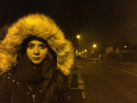
Poster Draft 2

Here
is my second draft for my poster, since the first I have changed the picture as
the character looks more approachable and I think will connect with the audience
better. I have darkened down the right side but still slightly blurred in and
then added more details to the poster. I have also changed the font of 'Ever
After' so that it matched with the other products from the campaign which means
that there's recognition between all three for the audience to connect them
with.
Saturday, 4 February 2017
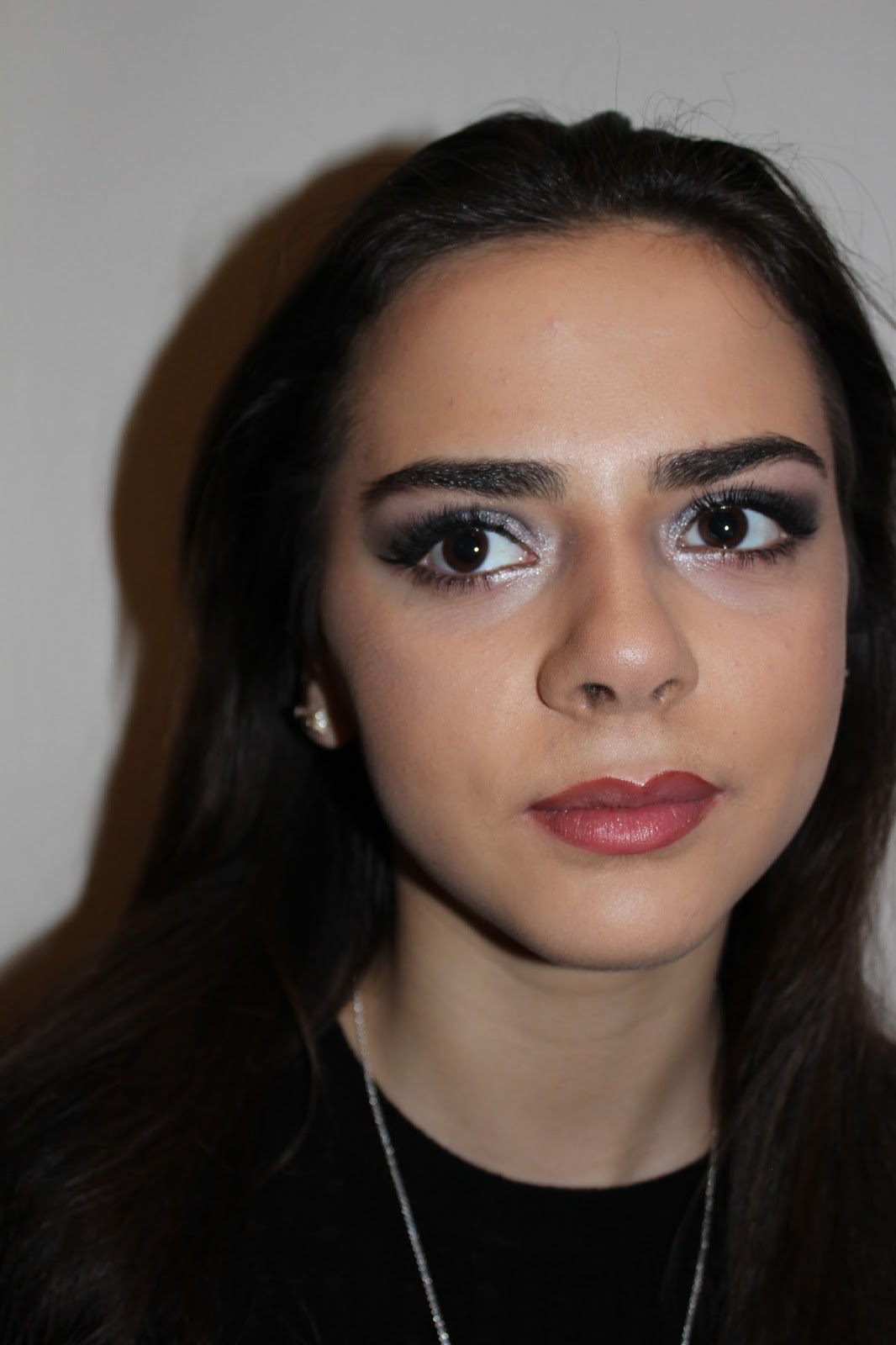
Magazine & Poster Photos
Once I had planned what my magazine and poster looked like I then had to go out and take the photos for each of these:
Magazine:


Poster:


Magazine:


Poster:


Wednesday, 1 February 2017
Sight & Sound (2014) Magazine Analysis

Sight & Sound follows a similar layout between their magazines
which is a central image that features a close up with text along the bottom.
The only blank space is to the sides of the featured person and so if I decided
to use Sight & Sound magazine I am going to have to use a similar layout.
This magazine features films which are similar to mine which will help me
design my own front cover. Along the bottom the words "Spike Jonze"
are larger than the rest of the text, this is because it's the selling point
for this edition and so needs to grab the reader’s attention. The text is
mostly white so that it stands out against the darker part of the picture it's in
front of. The colour scheme is quite dark and dull with the Sight & Sound
logo at the top bringing the most colour to the magazine cover. The bar code is
to the right side of the magazine towards the blank space so that it doesn't
take focus away from the main parts to the front cover.
Sight & Sound magazine is
one of the choices I have for featuring my magazine scince I have decided to
change and because the magazines all follow the same similar layout I will have
to make sure that mine follows these same themes.
Tuesday, 31 January 2017
Little White Lies (2016) Magazine Analysis

Little White Lies follows a different layout for their magazine front cover compared to most generic magazines. This cover from May/June features one main central image that takes up the whole of front cover which is common throughout the Little White Lies magazine, this is because it then draws attention to the audeince. The audience focuses on the one image and so this makes the magazine stand out from others and egages audiences. The girl is looking stright foraward which connects the audience to the character. The colour scheme is red and blue which is vibrant and so again attracts the audeinces attention as well as the picture having a cartoon filter over the top, this seperates Little White Lies from any other film magazine.
The font used for 'The Neon Dragon' looks like the words are dripping which then links to the horror genre conventions but the colours contradict that by matching the colour scheme of bright colours. The white circle logo at the top is the same on every Little White Lies magazine and so makes it recognisable to the audience.
I think that because I am changing my magazine from Empire, Little White Lies would fit my independent film and so could be an option of the magazine I choose to feature my film. I like that Little White Lies produce covers that are different and individual and I would like to maybe create a Little White Lies magazine cover.
I think that because I am changing my magazine from Empire, Little White Lies would fit my independent film and so could be an option of the magazine I choose to feature my film. I like that Little White Lies produce covers that are different and individual and I would like to maybe create a Little White Lies magazine cover.
Monday, 30 January 2017
Diary Entry #12 - Magazine Design Update
From looking at my audience feedback for my magazine, I've decided to make a cover for a magazine more suited to my film. I looked into Sight & Sound Magazine and have decided tomake a cover for this magazine instead.


I looked at some of the magazine covers they have produced and have come to find that the images used are mostly close up of the actors face with the 'Sight & Sound' name written across the top stretching out so that it reaches both sides of the page.
The magazine also has the barcode with the price on the right side of the front cover and mostly uses red, black and white text along the bottom. There's a mix of different sized text depending on the picture, with smaller stories written with bullet points.
The colours used in each cover are quite basic and limited with the brightest colour being the title of the magazine. The backgrounds are bare with the actors face taking up most of the cover.
To make my magazine cover seem more realistic and professional I am going to have to include all these features into it.
Subscribe to:
Comments (Atom)