After
receiving my feedback I realised that there was more too add to this trailer in
order for it to be successful, mostly it was more footage. I have more ideas
that I will add into my first draft which I will then post onto Facebook to
gain more feedback.
Earlier today I used the software Garageband to practise creating a piece of music using the software. I found garage band quite easy to use and think that this will be perfect for creating the final soundtrack that will go with my trailer. I played around with some of the sounds and found a few I thought could maybe fit my genre and theme of my trailer, once I have filmed and created my trailer I shall go back to Garageband to create the soundtrack.
When researching fonts, I will have to find one that matches all three of my products so that I could use it throughout my campaign, this will create recognition between my three products.
This font is called Fragmentcare,
it looks like a typewriter which I though was appropriate and fitted the ironic
title. The font along with the words could suggest the storyline of the film is
similar to those in fairy tales and so along with the visuals planned for the
trailer and poster the font will contradict this.
This
font is called HBM Razed Galerie, I like this font because it's different and I
think would attract the 15-25 aged target audience I need. My trailer is going
to tell the story by mostly visuals and music so I need to find a font that
matches the vibrant and lively theme of the film and campaign.
This font is called basictitlefont, this font is easy to read and would appeal to all audiences this will give my campaign a more mature look that links with the adult themes I have used.
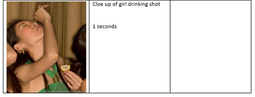
Here are the firsts shots I plan to use in my trailer, I feel that these shots link to the genre and so the audeicne will understand the theme of the film within the first 30 seconds. I have chosen to use very little dialogue, this is because my trailer wil mostly engage with the audience from the visuals. There will be a soundtrack to help the audience understand the narrative and to emphasis the change in tone.
0.00 - 0.06 - MPAA information screen
0.06 - 0.09 - Mid shot/tracking
0.09 - 0.10 - Close up
0.10 - 0.11 - Pan
0.11 - 0.15 - Production company
0.15 - 0.16 - Black screen
0.16 - 0.17 - High angle
0.17 - 0.18 - High angle
0.18 - 0.25 - Tilt
0.25 - 0.27 - Close up
0.27 - 0.30 - Over the shoulder zoom
0.30 - 0.32 - Pan
0.32 - 0.36 - Zoom
0.36 - 0.37 - Black screen
0.37 - 0.38 - Tracking shot
0.38 - 0.40 - Intertitles on a black screen
0.40 - 0.42 - Mid shot
0.42 - 0.43 - Tracking mid shot
0.43 - 0.44 - Wide shot
0.44 - 0.46 - Intertitles on a black screen
0.46 - 0.47 - Close up
0.47 - 0.48 - Wide shot
0.48 - 0.49 - Two shot
0.49 - 0.50 - Close up
0.50 - 0.51 - Mid shot
0.51 - 0.52 - Long shot
0.52 - 0.53 - Spinning intertitles on a dark screen looking up at buildings from a low angle
0.53 - 0.54 - Close up
0.54 - 0.55 - Tracking shot
0.55 - 0.56 - Long shot
0.56 - High angle close up
0.56 - 0.57 - Two shot
0.57 - 0.58 - Slow motion mid shot
0.58 - 1.00 - Intertitles
1.00 - 1.01 - Pan
1.01 - 1.02 - Two shot
1.02 - 1.03 - Pan
1.03 - 1.04 - Slow motion mid shot
1.04 - 1.05 - Tracking shot
1.05 - Slow motion mid shot
1.05 - 1.06 - Tracking shot
1.06 - 1.08 - Long shot
1.08 - 1.18 - Ariel shot of buildings turn into the main title of the film
1.18 - 1.21 - Ending intertitles
From completing this task I found that using a good variety of shots in different orders help to show the different angles of the film and show the story, I also found that the trailer sometimes has more than one shot a second to create a fast paced trailer which then changes the mood. I know that looking at my genre and type of trailer I am going to have to have a lot of shots at a fast paced in order to fit the theme.
The film 'Blue Valentine' is a Romantic Drama film and so I wanted to focus in on the intertitles to get a better idea of the conventions for the intertitles from this type of film.
The first
intertitles we see are the film festival logos, these are usually featured on
independent films and so maybe something to consider when coming to produce my
own. Using these logos shows the audience what type of film trailer they are
about to watch and that this isn't the typical Hollywood blockbuster. The
trailer doesn't use many intertitle screens throughout as it tries to get the
audience to focus on the visuals and music when understanding the storyline,
this is also something I may try to incorporate as my trailer will rely on the
visuals and soundtrack in order for the audience to follow the narrative and
decisions made by each character. This is why the intertitles are plain and
simple so that the audience doesn't get distracted by the text shown to them.
The use of intertitles featuring more famous actors shows that’s the most
important thing to be mentioned using text, my trailer however will not follow
this layout as I have unknown actors that the audience won't be able to
recognise and so won't attract an audience to the film. The final title screen
is different to the other and so grabs the audience’s attention by standing
out. The colour scheme used is black and white, this is because colours may
distract the audience from watching the footage closely to understand narrative
which is also a feature I wish to include in my trailer.
Overall, from looking at the intertitles from Blue Valentine I
have now a better idea of how I want the intertitles in my trailer to look and
why the creators have made their decisions.
This magazine cover is slightly different
to the other film covers I've looked at as it features more than one character
in the main image. Audiences will already know the characters shown as the
magazine is promoting the second film in the series and so with the way the
characters are positioned could suggest some sort of relationship triangle
between the three characters. The female character is the only one looking
directly at the camera implying that she has the power and more control out of
the three characters.
The words 'new moon' are illuminated to go
with the theme of darkness which the magazine has used, these words stand out
as well as the word ' Film' to grab the reader’s attention and direct you too
main selling points of the magazine, being the film Twilight: New Moon. They've
also used a smaller image of spider man on the side to attract a larger
audience as the different types of films will make different people want to buy
the magazine.
I most likely won't take inspiration from
this magazine, it has a different tone as to what I am trying to create with
mine. I will however use a similar dark colour scheme that will fit the mood of
my trailer.
The main image used is of the main character Captain Jack Sparrow,
played by Johnny Depp in full costume showing the audience the character so
they recognise him straight away. This is the magazines unique selling point as
the actor is very well known and has appeared in many films automatically
drawing in the audience. The magazine was released before the 4th film was
released and so there is an already growing fan base from the previous films
which would target an audience excited for the new film. The picture has been
taken so that the character is looking straight at the audience, this grabs the
reader’s attention because he looks like he is staring directly at the person
looking at the magazines so is hard to ignore.
The font used is bold and
bright, which corresponds with the characters personality. This makes the
audience feel like they can connect with the character as they feel like they
know him from the past films. Mostly all writing in the cover is in capitals,
this makes the audience want to read the story lines as they're jumping out to
the audience. The use of yellow and white text following each other shows that
the stories are different and so the audience reads each one, where as if they
were all yellow the audience may think that the stories were all relating
instead of being separate.
I like that the main character
is photographed from the waist up so the audience has a closer view of the
character and detail, they've used the actor dressed as his character in the
film and that might be an idea I could use when creating my magazine. They've
also used a background that relates to the character and so I might use a
similar layout when producing my magazine.
This Empire magazine cover has used the
photo of the Joker from the film Suicide Squad as the main focus point for this
page. He is right in the centre looking directly at the audience. This allows
the viewer to connect with the character increasing the chance that
they will eventually buy the magazine.
The colour scheme used is white, purple
and green, which resembles the colours used for the joker in the film and other
films with that character included. This is quite a bold colour scheme and make
the audience feel threatened by the mix of colours and picture used.
The font used for 'Suicide Squad' is bold
and fun which then corresponds with the character name the joker used for the
picture, it's been positioned towards the bottom however it's the first piece
of text that catches your eye after looking at the picture. The mix of the
green and white text look good on the page as it tells you what pieces of text
are more important and what you should look at first by giving more detail
afterwards.
I might chose to use a picture of the
character as my central image rather than a photo of the actor outside of her
character, this is because it creates recognition between the products from my
film campaign. I also like that there is a consistent colour scheme which uses
very little colours, I will most likely use a colour scheme like this when
creating my poster.
The film poster for 'The Perks of Being a Wallflower' uses the
three main characters as the unique selling point. The audience will recognise
Emma Watson from her role in Harry Potter, and the other two actors have
starred in films such as 'Percy Jackson' and 'We need to talk about Kevin'.
This way the poster creates a larger audience by bring these three actors
together and making them the focus for this poster. All three characters are
looking straight ahead so that the audience connects with them as you pay more
attention when given eye contact. The female characters head is leaning on one
of the males’ shoulder suggesting a relationship, but then leaving out the
second male character possibly suggesting some tension and therefore intriguing
the audience.
The green background is the
same colour as the original book and so the audience can make a connection
there which will make them want to look more into this film. It also helps the
picture of the characters and the writing above to stand out more. Also from
the book is the tagline 'We are Infinite' which again gives the audience a
connection between the film and book and so already has an interested audience.
The title of the film is in a type writer font, they've used this
style writing as it becomes a theme throughout the film and something that
reoccurs. The main character uses a typewriter to write his diary entries and
his dream is to be a writer and so this font is appropriate for the film
poster. Included are links to social media websites such as Twitter and
Facebook, suggesting the poster is aimed at a younger audience who will be
following these sites to find out more.
I like this film poster as it's quite simple not needing to be too
exciting because of the existing fan base for the books and the actors
including. This works for this poster as they only need to focus on these
features as that’s the films unique selling point. To focus my poster on the
actors may not work as well for my poster because the actors I will use are not
well known and so the audience may not be interested.
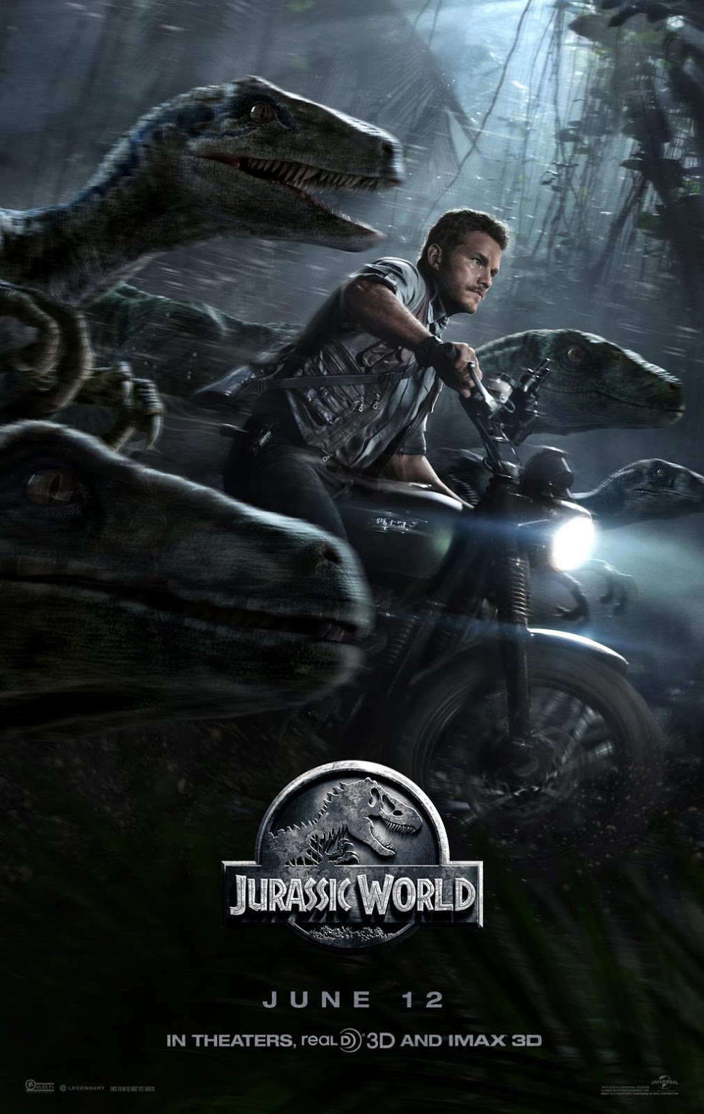
This is the film poster for the
2015 film 'Jurassic World'. The colour scheme used is quite dark and uses
a lot of blacks and greys, this set the tone for the film to be dark with a lot
of deaths involved and isn't going to be a light-hearted film.
The main focus of the picture is Chris
Pratt, well known for 'Parks and Recreation' and 'Guardians of the Galaxy',
although there is a lot going on in the picture your eyes are automatically
focused on Chris Pratt. He has been used as a selling point told by the poster
as a lot of the audience will have seen his previous acting work, it will also
attract different kinds of audiences that will give the film a larger viewing.
The dinosaurs are also a big part of the poster, they're engaging with the
audience making them question what they've been told in the previous Jurassic
park films that the dinosaurs are the enemy. They have been positioned to look
like they're working together with Chris Pratt instead of chasing him.
There is little to no text on the poster
only letting the audience know the main facts about the film, because this is a
teaser photo it doesn't need all the details as the Jurassic park franchise is
already well known and so audiences would be excited just from seeing the
dinosaurs in the picture.
My poster will be a theatrical poster, not
a teaser poster because my film doesn't already have that existing audience and
so I need details on my poster to attract audiences. I will use a similar kind
colour scheme to this poster to set the atmosphere of the film, as well as
having a single photo of the main character.
The film poster for 'It's kind of a funny story' uses few colours which makes the pictures stand out. The main colour used is blue which is used a lot through the film to generate the atmosphere the creators want. Blue has connotations of sadness which is the main focus of the film and so gives the audience an insight as to what the films about. The colour blue is also used through costumes as the characters seem to be wearing hospital uniforms which may implicate death.
The font used is simple which implies a more serious tone of the film and so shows that the target audience is older and more mature, which is a similar target audience to mine. Therefore, I would like to consider using a similar font for my poster or trailer to attract my audience.
The three main characters are shown intertwined with the titles all looking happy which contradicts the images below of the two characters dressed in the dull uniform. The location may intrigue the audience as it's rare to see people in hospital uniforms together looking out over rooftops.
I like this poster as it's quite simple but gives the atmosphere of a happy different kind of film to other products already produced. I however, could use the three main character as the focus of bringing in my audience as the actors I'm using are not well known and so having their names and pictures as the main attraction on the poster wouldn't have the same impact.
The trailer starts with the production company logo whilst the soundtrack plays over the top.
The establishing
shot is of a city surrounded by a large field maybe suggesting that the main
character s isolated and alone as she lives far away from anyone else. From
first looking at this setting the audience can tell that this will be a drama
film as there are flat blocks and a fence going around the field, and so this
scene isn't especially pretty or scary looking which are the conventions for a
romance or horror. This setting is suggesting to the audience that it is going
to be realistic and is going to be facing the problems of struggling people in
Britain. The sound track continues to play over the top.
There is a close up of the main female character applying dark makeup to her eyes, as my main character will be similar to this one I might use a similar shot or focus in on her makeup for my trailer. The setting surrounding her face is blurred out so that the audience only focuses on her actions. Shouting is heard over this footage which makes the audience question what's going on in the characters life.
The first couple of intertitles are stating the films awards at previous film festivals, this then already gives the audience an expectation for the film as they now imagine the film to be good and engaging. I don't think it would be appropriate to use these intertitles in my trailer as my film would not been entered into any film festivals and could still be successful without.
The next intertitles help tell a story with their words, they help explain the narrative to the audience so that what the audience is thinking about the character is then confirmed. The light blue text with lighter glows represents the title of the film 'Fish Tank' and that how the water looks when the sun shines on it. This could have a hidden meaning for the audience suggesting that the character is the water and needs the sunlight in order for her to achieve.
Throughout the trailer there is fast paced editing which helps build tension and also shows the audience lots of shots from the film so it sets the scene and gives them enough information to make them want to watch the whole film.
Again the tension is built up just before the end
of the trailer through fast paced editing and louder more dramatic music. The
music suddenly cuts out and the screen goes black, the only noise is the sound
of the female breathing heavily which is then shown visually soon after. I
would like to create a similar ending to my trailer where the tension build but
then it's abruptly stopped and leaves the audience with a lot of questions and
creates enigmas.
Overall, I think there are a lot of elements I
would like to take from this trailer and bring into mine, I like the soundtrack
that was used and how when the tension grew the music got louder and more
intense and when the atmosphere changed so did the music. This made it very
clear to the audience that the tone of the film had changed and so I would like
to incorporate that into my trailer. This trailer didn't feature too many
locations because it was trying to be realistic it followed the life of the
teenage girl and so it would be unrealistic if she travelled far. I will use
the same for my trailer as I believe it is truthful that the teenagers featured
in my trailer will not have money to travel and so will be filmed in one town.
I also liked the fast paced editing in the trailer that also established the
mood of the trailer. I am going to take inspiration from the ending of this
trailer as I think it leaves the audience wanting to watch the film and also
leaves a lot of unanswered questions and enigmas.
The production company fade in and off screen, this shows the audience that this film is going to be a low budget British film as it's not made by a typical Hollywood production company.
Non-diegetic music plays which is fast and up to imitate the action being played alongside. A voice over is also introduced which we find out is the voice of one of the characters. The close up mid shot shows four men running insinuating a chase, this creates an enigma as the audience doesn't know what's happening and are left wondering.
The first character 'Renton' is introduced through the windshield of a car, this is the main character of the film and has been introduced first. At first sight of this character the audience may feel intrigued as to see what has happened to him and to what he is going to do next. His face is discoloured and he looks very happy only just nearly been hit by a car, The film follows him and his heroin addiction and this shot gives a hint at that to the audience.
We are then shown a close up of the main character with a female, however she was not introduced the same way that he was and so the audience are lead to believe that she will be less important in the film. The characters are looking straight at each other suggesting some kind of relationship between them that may be related to the story line of the film. We then hear her talking about 'Renton' and again implies that he could be a bad character.
We're then introduced to the next character 'Spud', he is shown by a close up with the same red and white writing. His scene in the interview highlights the comedy that will be in the full film and shows this character to be more humorous than the others.
The next characters presented to us are 'Sick boy' and 'Begbie'. Sick boy comes across as quite comedic as when he is talking with Renton he puts on a different voice, Begbie however is presented differently to the other characters.
He is aggressive and the voice over says "He's a bit of a psych" whilst the visuals show him attacking another man in a bar. The music in the background contradicts this as it's still upbeat, this shows that whilst the film could be funny it also includes some darker characters who will change the tone of the film.
The inter-titles are bright and colourful which stands out against the black background. Instead of actually relating to the film the inter-titles are reviews which make the audience then want to go watch the film. I think I would like to include this into my trailer as it would go with the theme and attract the audience into watching the full film.
The rest of the trailer includes a range of shots and locations without giving away anymore of the story-line and so forces the audience to have to watch the whole film to find out anymore. This is what I want to do with my trailer, create fast paced editing so that it's exciting but still have enough differentiation in order to keep it interesting.
The final shot is of all four main characters standing together whilst a train goes past, this goes with the name of the film 'Trainspotting' although the film is about something completely different. The audience then want to watch the whole film to see what kind of trouble the characters get up too and can possibly relate to the behaviours shown.
From looking at this trailer I have decided that I would like to use faced paced editing and up beat music to keep the trailer exciting and use a wide range of locations and shots so that it comes across as different and the audience will want to watch the final film because they want to know what is going to happen to the characters.